There's a line on Antoni Kirk's About page that more or less explains the whole brand:
"Why go through life as a back-up dancer when you can be the Star?"
Antoni Kirk Apparel is a Palm Springs luxury resort wear label: small-batch, ethically made, built around super-soft knits cut for desert living. The signature piece is a fitted kaftan with a dramatic Watteau back, structured where it counts and theatrical where it matters. The collection is called SP26, and every piece in it is named after someone Antoni loves: June, his fashionista mother who owned and wore a rhinestone tiara. Linda, his fearless friend who never met a chunky necklace she didn't love. Kenny, his dad, the Producer in more ways than one.
The brand voice is camp, witty, and unapologetically theatrical. The tagline is Arrive. Slay. Repeat. The manifesto is Be Bold. Be Bright. Be the Headliner.
If you're a web designer, a brand like this is either a gift or a disaster. Because the one thing you absolutely cannot do is flatten it into a generic Wix template and call it done.
This is the story of how that site got built and the thinking behind some of the choices most clients never see.
The Brief Underneath the Brief
The stated job was straightforward: build the e-commerce site for Antoni Kirk Apparel's debut.
The actual job was harder. Antoni didn't need a website. He needed a home base. A place his brand could live, where his collections could be shown the way he wanted them shown, where his event calendar could keep up with his life, and where customers could actually buy the work without bumping into anything that broke the spell.
That's a different problem than "make a site." And it's the kind of problem you only see clearly if you've spent time thinking about how things work after they go live.
I came up the long way to web design, twenty years across a lot of different jobs and industries, eventually overseeing employees and helping run multiple departments at the company I worked for last. I'm a self-taught developer with some schooling but not much; at this point, most of that schooling was outdated and I had to start learning from square one. Most of what I know I learned by being the person in the room who noticed the small thing nobody else had flagged. That habit doesn't switch off when I sit down at a code editor.
For the Antoni Kirk site, that meant a few decisions that wouldn't show up in a portfolio screenshot but mattered more than the screenshots ever would.
The Typography Was the Brand
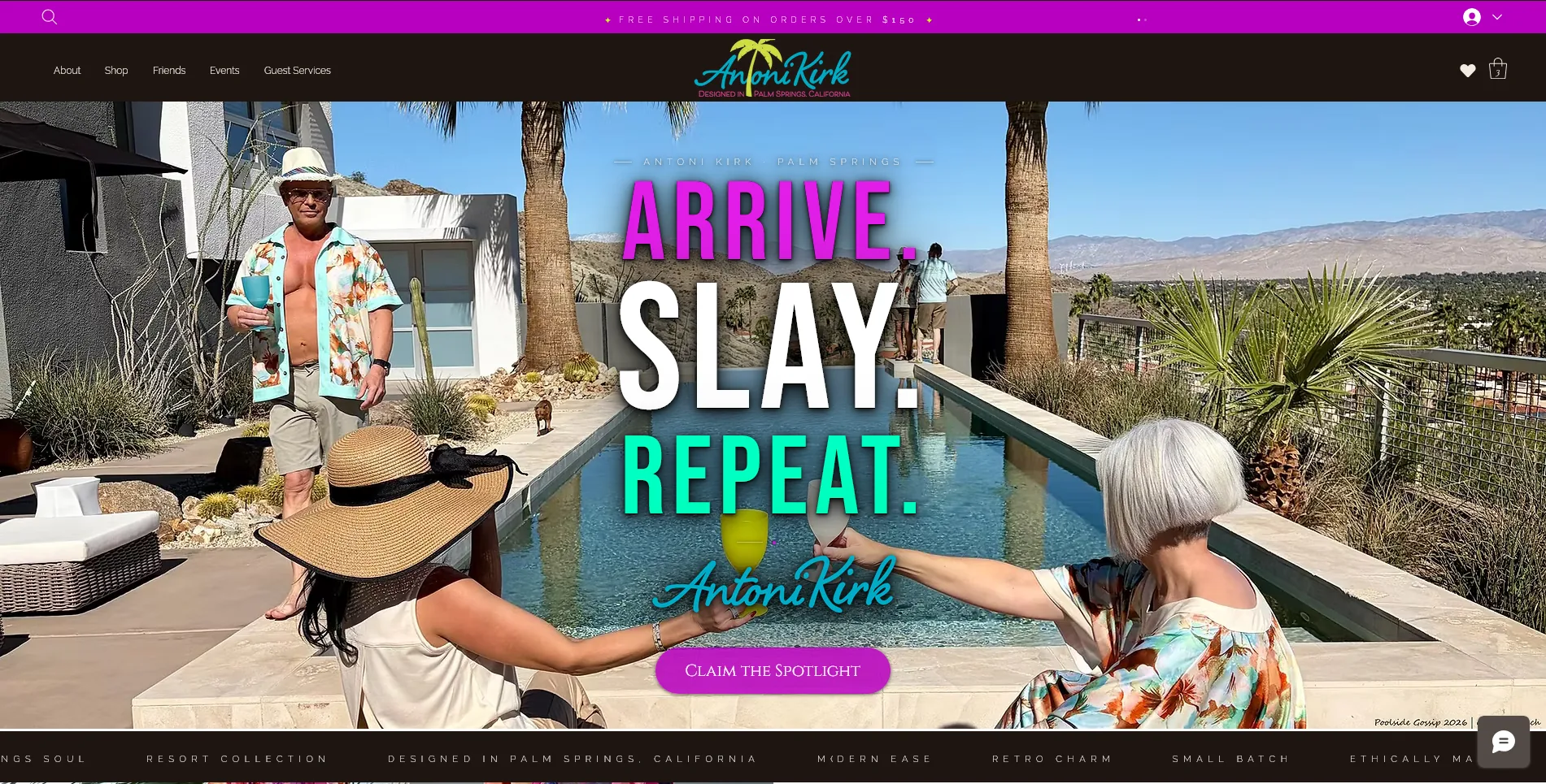
Most Wix builds use Wix's default fonts. They're fine. They're also generic, and a generic font on a brand whose entire voice is "Be the Headliner" would have been a quiet betrayal of everything Antoni was trying to say.
So we integrated three custom Adobe Typekit fonts across the entire site; chosen specifically to carry the theatrical, vintage-glamour register of the brand. Headlines that feel like a marquee. Body copy that feels like a program. The typography doesn't just display the brand voice. It is the brand voice.
That's the kind of decision that takes longer, costs more, and most clients never know to ask for. But the moment you land on the homepage of antonikirk.com, you can feel it, the site isn't borrowing personality from a template. It has one of its own.
A CMS He Could Actually Use
Antoni runs an active life. Charity events, social galas, kaftan parties, appearances, collection drops; all of it on his own schedule. It is a high-energy environment where plans can pivot in an instant as events come together.
The lazy version of an events page is a static block of HTML somebody emails the developer about every time something changes. The version we built is a CMS connected to repeaters on the live site. He logs in, adds an event, and it appears. He removes the event when it's over, and it comes off. No developer in the loop. No waiting on me. No email thread for a one-line change.
This is what people mean when they talk about a website that works for you instead of one that just exists. Antoni runs his own brand. The site is built to keep up.
The Audit Most Designers Don't Do
Here's the part of the project I'm probably proudest of, and it has nothing to do with how the site looks.
During the build, I asked Antoni to walk me through how he was handling payments; what processor he was using, what his statement looked like, what his chargeback exposure was at his price point and customer profile. Most web designers don't ask those questions because most web designers think the website is the project. The payment processor is somebody else's department.
But the payment processor is part of the customer experience. It's where the transaction actually happens. It's where the small fees that add up live. It's where a chargeback dispute either resolves cleanly or burns a relationship.
The audit turned up about $120 a year in unnecessary statement fees and a configuration that carried more chargeback risk than his customer profile required. We cleaned both up before the site went live. That work won't show up in any screenshot. It will show up on every statement Antoni receives for as long as the business runs.
That's the difference between a website project and a business decision. And it's the kind of thing you only catch if you've spent a long time being the person who notices small things early.
The Site Itself
The platform is Wix Business; chosen specifically because Antoni needs to run it himself, because the design flexibility serves a visual brand, and because it gives him room to grow without forcing him onto infrastructure he doesn't need yet. Right tool for the right business.
The architecture covers the things a real fashion brand needs: a shop, a story, a friends section recognizing the people who shaped the brand, an events calendar he controls, and customer support that's actually reachable.
Schema markup runs underneath all of it; the structured data layer that tells search engines exactly what the site is, who it belongs to, and what it sells. It passed Google's Rich Results Test on the first submission. That matters more for a brand new domain than most people realize.
Go See It
The best version of this article is the one you stop reading to go look at the actual site. Antoni's voice is all over it; the About page in particular is one of the most fun pieces of brand writing I've gotten to work with; and the SP26 collection deserves to be seen on its own terms.
If you're a designer, a brand owner, or anyone who appreciates a story told well, take ten minutes and explore. Read the Acts on the About page. Look at the names on the products and then go read who those names belong to. The whole thing is a love letter to the people who made him who he is, dressed up as a fashion line.
Headliners, after all, deserve a stage worth standing on.
Thinking about a website that works as hard as your brand does? Reach out — first conversation is always free.